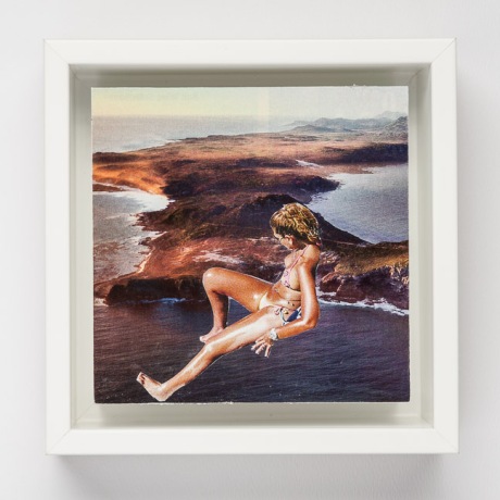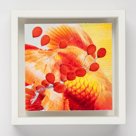
“Afloat” Image. Ceres Gallery. New York. Solo Show.
I remember every outfit I have worn on every occasion. It’s not that I pay that much attention to what I throw on. Believe me, some days I go into my closet and drag out just anything. Mostly my Indian patchwork pants when I have nothing in sight to wear.
For instance (and those of you who have heard this before, just go on to the next), I still own the skirt I was wearing when President John F. Kennedy was assassinated. Not only do I remember the skirt and the blouse, but I still have the skirt and I placed a note on it with a safety pin, so that if something were to happen to me, this madras skirt would be documented. (I no longer have the blouse which was pale pink with smocking across the top.)
I remember what I wore when I first had lunch with my husband. We got lost in the parking lot and I thought it was going to be a great romantic escapade, but when he said something about me stealing his wallet, I was flattened. The dress was filmy and black and white striped with flying triangles all over it. Puffed sleeves. Very Eighties. And by today’s standards, really hideous.
The Earth Shoes, jeans, and Scandinavian sweater I wore at a disco (after I went ice skating) when I met the guy I was to move to Atlanta to be with. And the way my hair looked that night. I remember the womanizer I had an affair with for one year and the lunch we first shared. I wore a Rick Springfield T Shirt, (whoever he is) and tight black jeans. And the blouse I wore when we broke up: coral. A blouse I had spent a lot of money on. And I had had it for years.
The red dress. When my boss made a move on me outside my five-story walk-up. He showed me where Mike Douglas lived, so as to impress me before driving me home.
I have to say, that if someone I love says something negative about what I wear, either about my jewelry or clothes. Or some traumatic event happens while wearing the item, I will never wear it again. My daughter said to me once, when she was little. “Mom, you act like my sweaters have feelings!”
Sam Cook’s Bar Mitzvah. This time I remember what my daughter was wearing. She wasn’t even invited and we made the mistake of bringing her. She wore a pale yellow CP Shades top and pants. She was five.
Anyway, you get the idea. I think pinning the note on the madras skirt I wore when JFK was shot is a little much. As if others value clothes and their memories as much as I do. In a few years I will give it to the Good Will.